New Project "Road to Ok" Quilt for My Bed (Top Finished!)

speckledhen

Intentional Solitude
Premium Feather Member
17 Years
Feb 3, 2007
79,946
16,013
1,366
Blue Ridge Mtns. of North Georgia
Would like some input, if you don't mind. I will be starting this quilt for myself as soon as the chicks in the brooder are gone and I can have my DR table back again. My DH loves burgundy/maroon and dark green. As a third color, I will add a deep gold color. I don't think I want the quilt to be predominantly gold. Anyway, here is the block itself, then it will make different quilts, depending on how you set them together. I have the burgundy and gold, but was wondering if it would be stupid to just use dark greens in whatever pattern I have, so all the greens, though dark, would be different fabrics.
The block in three colors. I want ours to be in burgundy, dark green and gold, but not look "christmasy", but more "cabin-y". In the following block example, the dark blue ends up being the star points. My question is, of the green, gold and burgundy, which color would you make the stars, when they come together? I hope I'm making sense! I'm thinking red stars, but not sure how that would look.

main.jpg

setting2.jpg

setting1.jpg

setting3.jpg


Another site showing the block and quilt setting variation:

http://delawarequilts.com/BOMs/RoadToOklahoma/
 
Last edited:
I like the first full quilt and the third one....I think if you use a "country/old time" print or the old brushed, it will keep it from looking at all holiday. Or where the dark blue is in your block example...use that for the gold and the bulk of it will then be burgundy and green. Does that make sense?
 
Last edited:
I love the first one but if you make the stars, where they come together burgandy then where the lighter blue is green and the light colored spaces gold...won't they look like Poinsettias?? Which to me would be beautiful. but with the red in the center they will look like flowers in that pattern?
 
gosh!! this is a tuffy..without the fabrics to play with..I agree with Ozark..you may have a flower look instead of star..Using different greens would be o.k. as l ong as they are really close in value..since the star is formed when the blocks are put together, would you use different greens in the block?..I think you need to keep the gold at a minimum to keep it from becoming predominant..???..lol..my grandmother would have cut/pieced and never had any question or concern about the outcome..and most times it worked but occassionally there would be one ugly creation..on the other hand I just over think and have a hard time deciding..now are you really confused??..if so..go with your first instinct!!
 
Quote:
A thought on colors, you have said that you didn't want it to be predominantly gold, have you considered using cream as in your block sample? I think I have this figured out correctly, use cream for the white, burgundy for the dark blue, various greens for the corner blocks and gold for your two center squares that are light blue with the first lay out design it will give you two diagonal lines of color. The four patch blocks will have movement with the different colors of green and be connected to each other with 2 gold blocks in between. I don't have any type of computer program to do a mock up, but I can draw it out later on today, if you find this interesting.
 
Carrie, you're right! I didn't think about the stars taking on a poinsettia look if they were in red! Good catch there! Verthandi, not sure who that would work out, what you described. I'll have to think on that a bit. I may be stupid, avoiding the gold being predominant. It's just that I've never done much in that yellow or gold color family, but with a dark red and a dark green, it really needs something lighter/brighter in there. Let me take pics of the two fabrics I have and then maybe that will help you see what I should do as far as which part is gold, green or red.
 
Here are two that I bought for this project. Guess I could just use the same color family for each, but get different print fabrics, like Cetawin hinted at, so greens, burgundies and gold will be different fabrics. That would switch it up some, I bet. What do you think? Took these outside to get natural light on them.

DCP_4163.jpg
 
Quote:
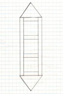
You will really have to use your imagination with this mock up...lol.(major low tech.) The assorted greens will give your quilt movement in the areas where the four patches of green come together and keep a more country/relaxed look to your quilt. The red and gold in one fabric choice will give the quilt some structure and a place for the eye to land and relax. I love this quilt block, it has so many possibilities. I'm sure it will be beautiful in whatever combination that you decide to use.

2200_scan0001.jpg
 

New posts New threads Active threads

Back
Top Bottom