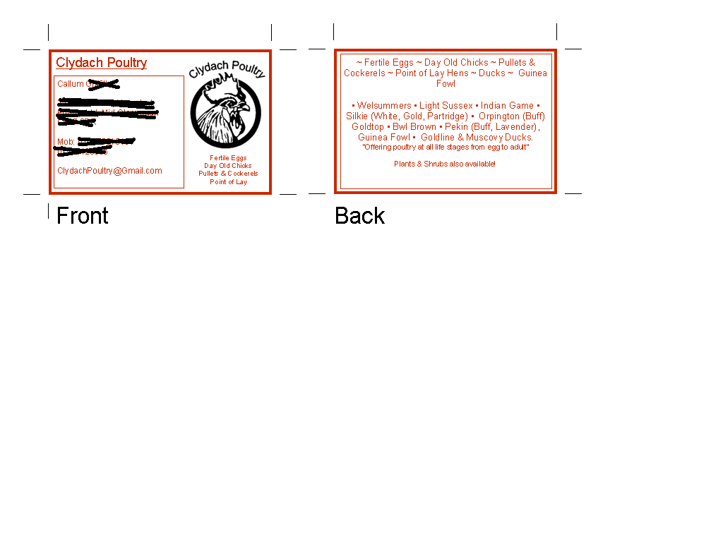
Tossing it out there while you're in the design process, but supermarkets spent a lot of money on marketing research that says red and blue together on white for some reason triggers an urge in consumers to buy, and either or red/blue on white appeals similarly (the findings were just not as strong) LOL
I would perhaps leave the card white, make the text blue, and have the lines on the design in red, and either red/blue/or black for the graphic (based on whatever aesthetics appeal) I would darken the red (if you want to keep it) to a brick red.
Also, would it be appropriate to replace "pullets and cockerels" with simply "adults" or "adult birds" to be more succinct? or shorten the whole chicken line to "from fertile eggs to mature (adult?) birds" I dunno... I'm sure there's a way to edit it to "flow" better.


