Business Card Idea's?

Here is my Card please could you tell me how I could improve?
114351_card1.png
 
Thanks for that!
I would like to keep to same font! Keep it simple!
Although I like red on my business card because its our color theme, Would it be okay with a different shade on red?
Thanks
Callum!
 
Maybe you could do a deep red text on white background? That would be in keeping with your business colors while being a little less aggressive to the eye.

I like it! Perhaps on the back instead of a comma-separated list you could use bullets so the breeds are easier to identify immediately. As someone said before it's a way to organize the information so the person pulling out the card remembers why they wanted it without having to read the whole thing.

Since you are offering everything from eggs to grown animals, maybe you could find a way to phrase that: "offering poultry at all life stages from egg to adult" (I admit, that sound weird and would need work) under your list... something like this:

-Welsummer
-Light Sussex
-Indian Game
-Silkie
-Orpington (maybe specify colors since this is such a popular breed right now)
-Goldtop
-BWL (?) Brown (unless this is really common maybe spell it out?)
-Pekin (duck or chicken?)
-Goldline Duck
-Muscovy duck
-Where are the guinea fowl you said you had?

Offering poultry at all life stages from egg to adult

The statement with phone & email is unnecessary and will use valuable space on the card. They already have that information.​
 
Tossing it out there while you're in the design process, but supermarkets spent a lot of money on marketing research that says red and blue together on white for some reason triggers an urge in consumers to buy, and either or red/blue on white appeals similarly (the findings were just not as strong) LOL
I would perhaps leave the card white, make the text blue, and have the lines on the design in red, and either red/blue/or black for the graphic (based on whatever aesthetics appeal) I would darken the red (if you want to keep it) to a brick red.

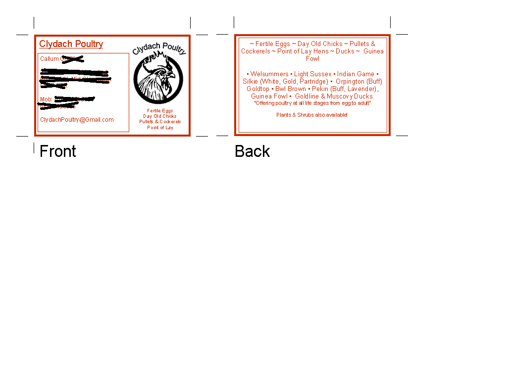
Also, would it be appropriate to replace "pullets and cockerels" with simply "adults" or "adult birds" to be more succinct? or shorten the whole chicken line to "from fertile eggs to mature (adult?) birds" I dunno... I'm sure there's a way to edit it to "flow" better.
 
Last edited:
The front looks good to me except the orange is very bold. It makes everything kind of blend in to the eye and hard to focus on. I would leave all the lettering black, do your email in vibrant blue and do your logo in red. It would make it pop off the card and be more noticable.

On the back drop the Fertile eggs to Guinea fowl lines and just list the breeds. You already have the Fertile eggs and stuff nicely outlined on the front.


Lanae
 

New posts New threads Active threads

Back
Top Bottom