Here's what I would do....
Ok... you asked for it..... i've probably gone overboard, if you like any suggestions go for it, if not that's ok too
")
(I were to pick one of the thoughts below for you it'd be to make sure that the name of your business apears on the back of the card. IMO, you could leave the back blank and but if you must put information there, the person you hand it to should be albe to see the business name no matter which side of the card they look at)
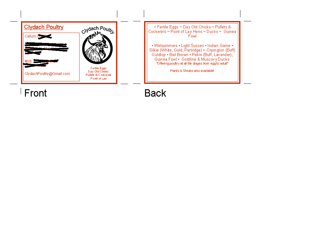
Front of the card....
- flip so that The logo is on the left and text on the right
- Change colors, make the logo red and text black
- Remove the text below the logo (it's the same info as you have on the back and doesnt seem complete)
- Align the logo so that it's centered (same amount of space above and below)
- In the text section, remove the name of the business as it's redundant with the name as it appears in the logo
- I can't see your address (understand why you blacked it out) if it's not there already, you could repeat the company name there in the same font as the rest of the address.
Back of the card
- Change font color to black
- Add (either the top or bottom) the name of you company (use bigger font like you had on the front but don't underline it)
- also include (right under the name, maybe smaller font) your preferred method of contact (email, phone or mailing address) You don't have to repeat all contact detail as it's on the front but reinforce the method you prefer best or think will be most commonly used.
- Consider removing some of the details, do you really need it all or is there a way to say with fewer words? This just seems a bit busy, remember it's a business card not a brochure. Also, will you always carry all of the same breeds or might you add some later or scale back? I'd just say something like 'visit our website to found more'
- You may be able to put the logo the back side as well, maybe a very light watermark in the background OR very small version. I'd play with that as well as the wording.
Bottom line... simple is best (imo)