Cream Legbar Working Group: Standard of Perfection

Pics

this was my boy that I lost this summer. If we could find a picture we could use it to create a linear template. I could cut out the silhouette and then place angle lines on it for a visual chart similar to the drawing I see on the Marans site. We could use the closest 'ideal' silhouette and to indicate slopes of back and stance even the triangular wedge body.

I can try to create some circular basic template for a logo that could be filled in with an image later.
Wow Blackbirds13...were we thinking of something similar? I made that trial logo before I left this AM, and now I am just catching up to the posts during today...like 46 people -- whoo hoo.

Seems we were thinking of the same thing, and I went back to Punnett's time for the silhouette -(so THAT"s how you spell it---duh--) My source is posted with the pict. I can send you files if you would be interested in the working files.
 
Usually....American is only used when the birds here are different than the birds in the country of origin.

Walt
That is a good insight. Would dropping the olive eggs, and putting more emphasis on the cream of the male hackles (female too I think) versus the UK's silver, make the birds different. I suspect that it would. Thanks again for your insights to the group.
 
So I was playing around a bit and this is a first draft. Format will have to be addressed - I chose circular as that was one initial suggestion. Background - I chose blue - blue eggs and we can Pantone that for exactness. I chose Monotype Corsiva for type and pilfered the bird and digitized it just for this example. I added a simple stroke outline. It can go in any which way from here.


Very nice Blackbirds13, I just saw this.

ETA - does anyone else have this typeface for a poultry club? It looks somehow familiar....
 
Last edited:
How is this guy for coloring?
Too much color I trust...


crele.jpg


Crele is best when intermediate.

This is the pure father of the creles above:
hollandse_kriel_koekoekpatrijs.jpg


as you can see two shots of barring can give you very light birds, but in the case of these dutch birds, they lack autosomal red, which brown leghorns do carry.....

I think the very light almost silver looking cream legbars are Cream double barred missing autosomal red, this could explain their very pale look


guys if you have any genetic questions, just PM ok...
 
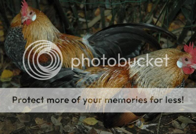
Here are pictures of my 2 roosters. After seeing pictures of the other peoples roosters and reading about the desirable traits, I am beginning to think that perhaps I should be letting Norbert breed with the ladies. Arnold is the dominant boy right now and I am sure that Norbert hasn't had a chance.

This is Norbert


And this is Arnold

700


Norbert has a longer back and a lot less chestnut. I think he is probably offspring from the second rooster that Greenfire imported. He took a lot longer than Arnold to mature too.
 
I like having both the hen and the roo on the logo, so I think an oval format works better than the round. Plus I felt the round too closely mimicked the Ameraucana logo. Not to discount blackbirds work- maybe combining the two with the black ring and the wording as she had them? Just my two cents.

Rinda
I like both hen and roo too.
 
Hi Redchicken9,

I got a couple more photos of my rooster tonight - hoping to narrow in on some of the questions.


I think that we do have the tucked up wings as the standard states since it is surprising to me how large his wings ARE - when extended.


If you click on the pict, more details are visible.


The chicken behind him is white, and there is a white feather in his tail. Ear lobes are white.

Unlike another poster, I quite like the white tail streamers....It changes the whole look of the rooster. It does look very flashy. Should a different color be the ideal in the SOP, I would still want the streamers....My roo has grown and lost a couple of sets of them....presently he is missing them, but they make the rooster look more streamlined IMO.
 
There used to be a saying that 'quick and dirty, is always dirty and never quick'.

Here is my idea for a logo for the club. I'll bet that the photoshop experts could do the samething better--but I wanted to put my idea out for some others to work with. I think it even matches the requirement that Omaeve mentioned about being recognizable. I stood across the room and it looked pretty recognizable to me.

http://www.ias.ac.in/jarch/jgenet/41/1.pdf This is where I used magnetic lasso to get the outlines for silhouettes.

Here is the draft. I think among other things it needs...a black outline to the oval, the name of the club, some variations on the blue---our eggs are blue but not that blue--- and some general clean up. I will work on that as time permits....but anyone else, (of course) feel free to use the link above, use this jpeg (i can send it to you if you wish) and/or your own thoughts to put some logo ideas in the running. It is meant to be solid black -- and can easily be horizontally flipped to reverse side of roo and hen -- etc


Not sure if any other poultry clubs use silhouettes, (spelling that wrong aren't I)--- but even if they do, they wouldn't be these cream legbar illustrations as the starting points. I'm thinking the blue is too aggressive. Any rearrangement etc. is fair game to all the artistic types out there....

ETA - wow, I hadn't see Blackbirds13 sample logo when I posted this---and I think that one is very nice! Good work.

ETA2 - now that I look at it -- the hen is too big. She needs to be smaller by about 10 to 20% I think.
well i think words around the side will work as well as a black line but i love the idea of the blue egg background and it would be nice if it could say auto sexing too. GOOD START
 
well i think words around the side will work as well as a black line but i love the idea of the blue egg background and it would be nice if it could say auto sexing too. GOOD START
The only trouble with putting autosexing on the logo, is if you put the logo on a T-shirt or baseball cap, and someone with no idea of what autosexing was...put you in jail. LOL. :0)

I am glad that you will be an instigator for the group.

BTW. there is some cream legbar art out there by an artist named Diane Jacky... I think. There is a plate with a female and male cream legbar and the plate has a light blue background. There are also mouse pads and T-shirts. Let's see if I can find a link.... http://www.zazzle.com/cream_legbar_chickens_plate-115460731560556806
 

New posts New threads Active threads

Back
Top Bottom