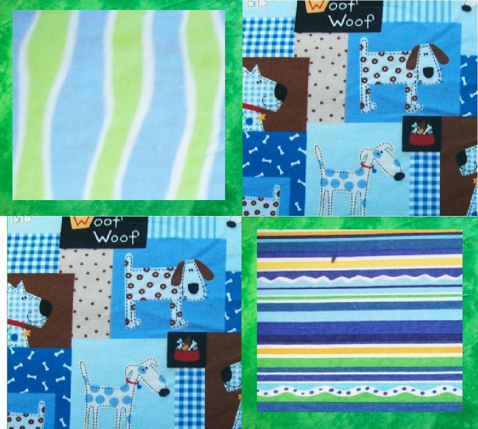
I actually like the top solid green one best if you want to accent the puppy print.
I think the 2nd one is so busy that you loose the puppies in it.
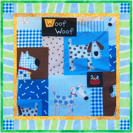
The third is nice, I think it kinda matches the busy of the print though, so neither one shines as the star of the quilt.
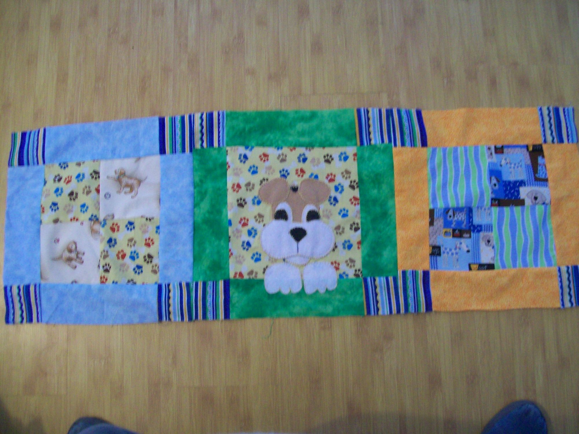
It may be cute if you have enough of the other prints to do a slightly smaller square of the others and border them with a thin strip of the solid, just to provide a visual break between all the prints. Then you could alternate the squares. I'll see if I can get a graphic of what I mean.
Using the puppies and just the second print would give me a headache to look at it.