- Sep 23, 2010
- 1,671
- 97
- 316
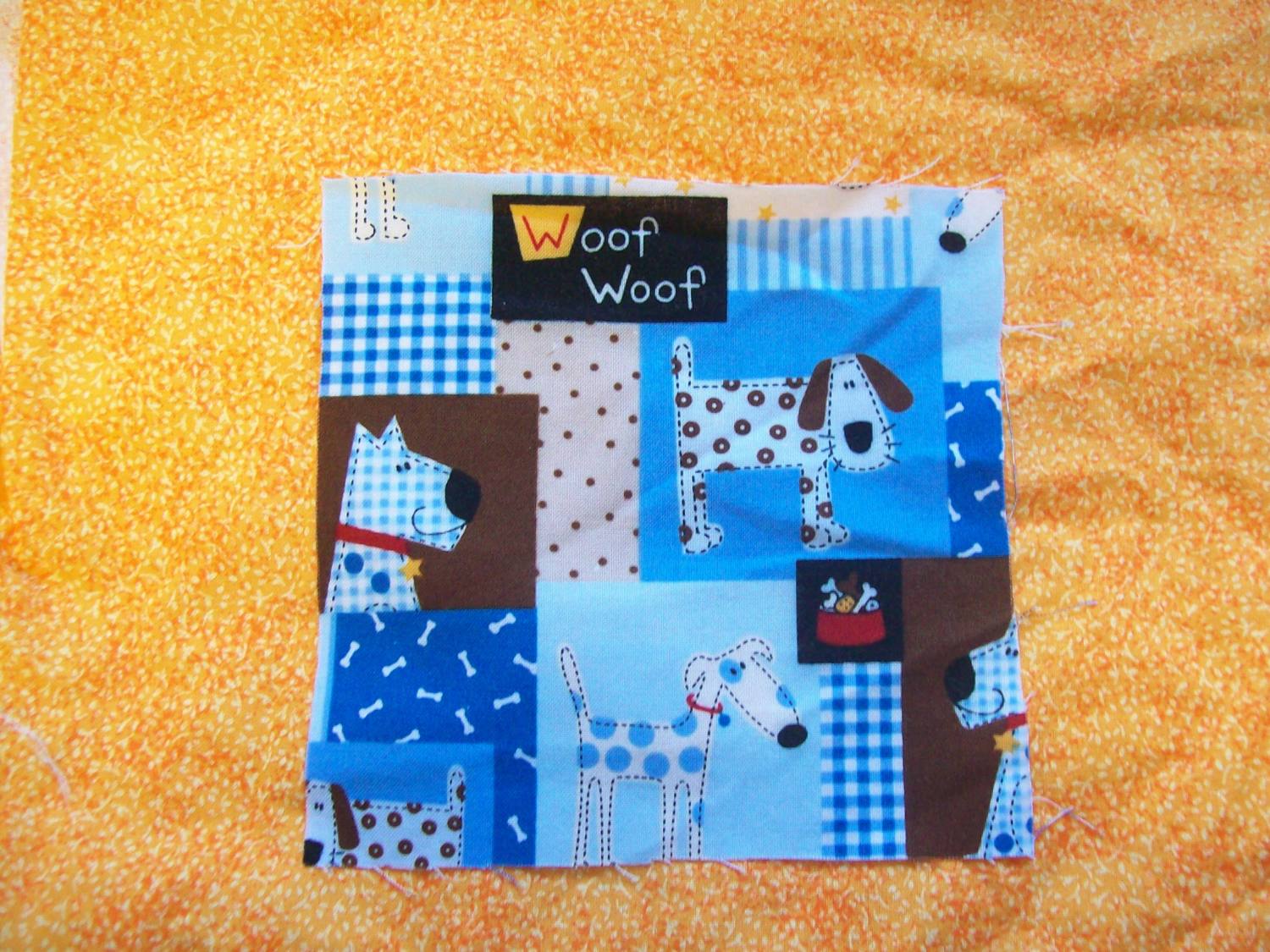
I'm makeing a baby quilt for a friend and like i say i horrible with colors, I'm planing on makeing a picture frame type baby quilt here is what i have which fabric do you think looks best with the puppies? or do i need to find someting different any suggestions?

this is a bright green it looks a little darker in the photo for some reason
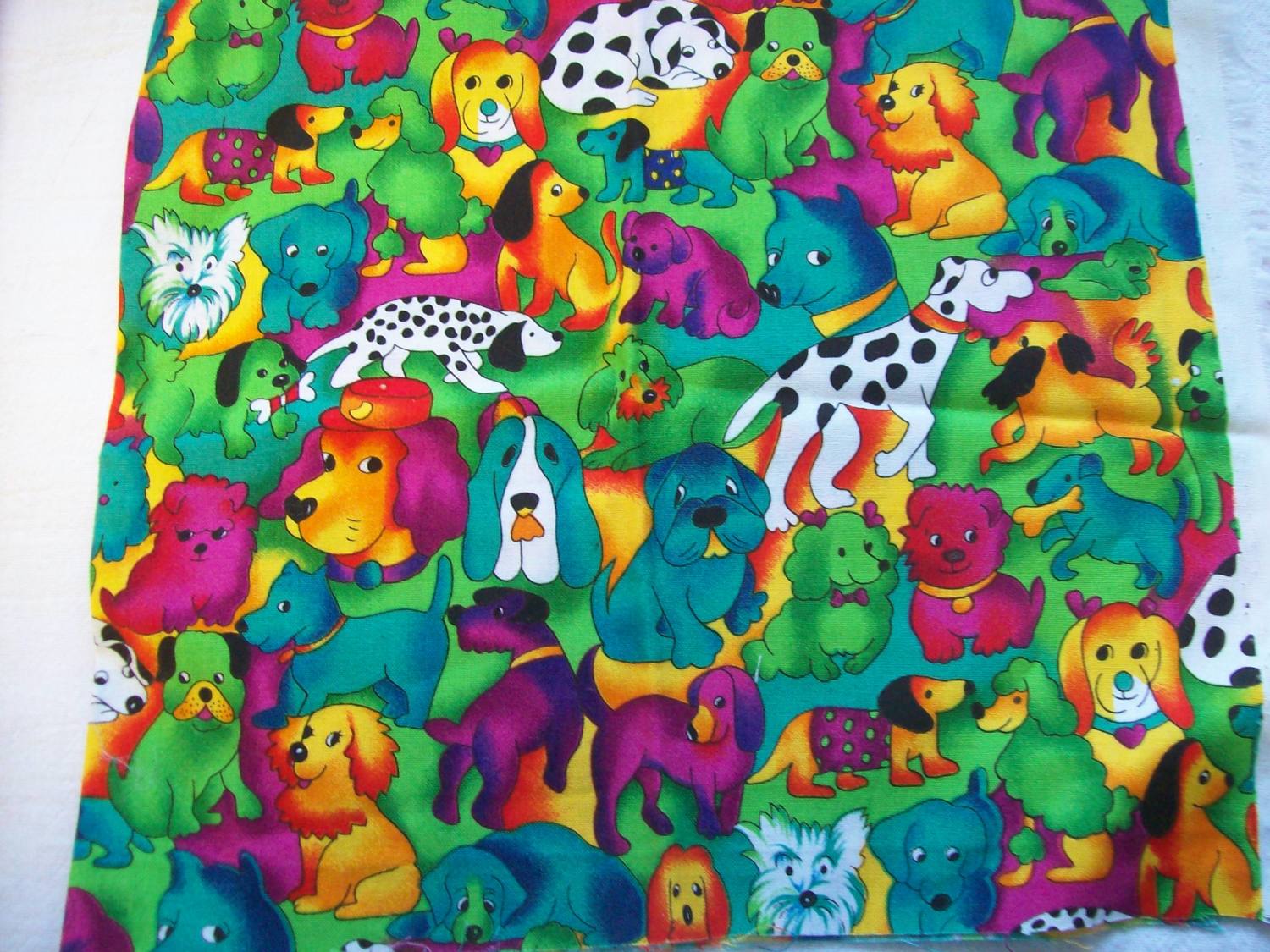
would this be to busy?
that one is a tad blurry but i think you can get the idea, She said the babys room was green and she was probably going to have yellow and blue acents also. Ok so what to you think?
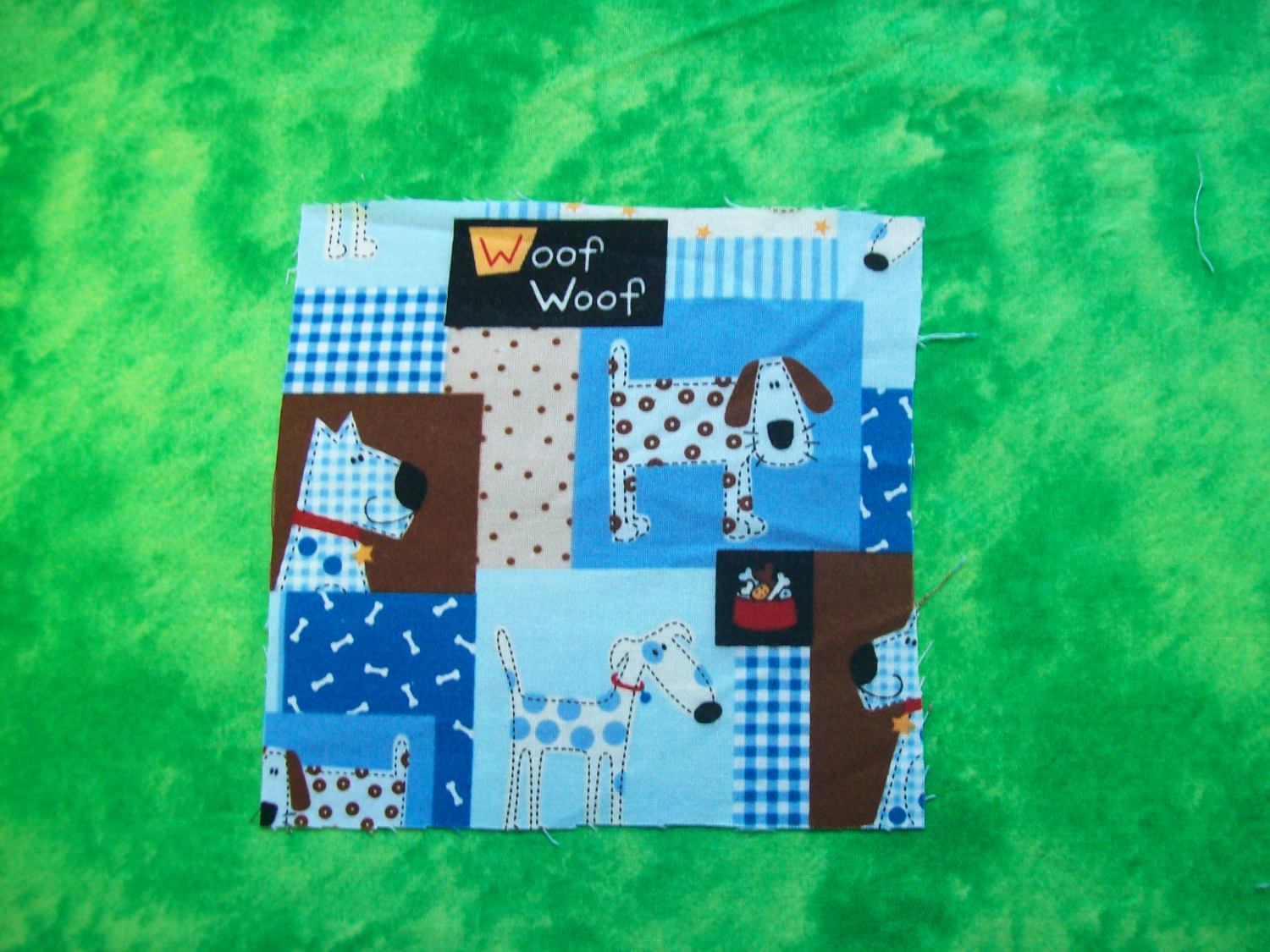
this is a bright green it looks a little darker in the photo for some reason

would this be to busy?
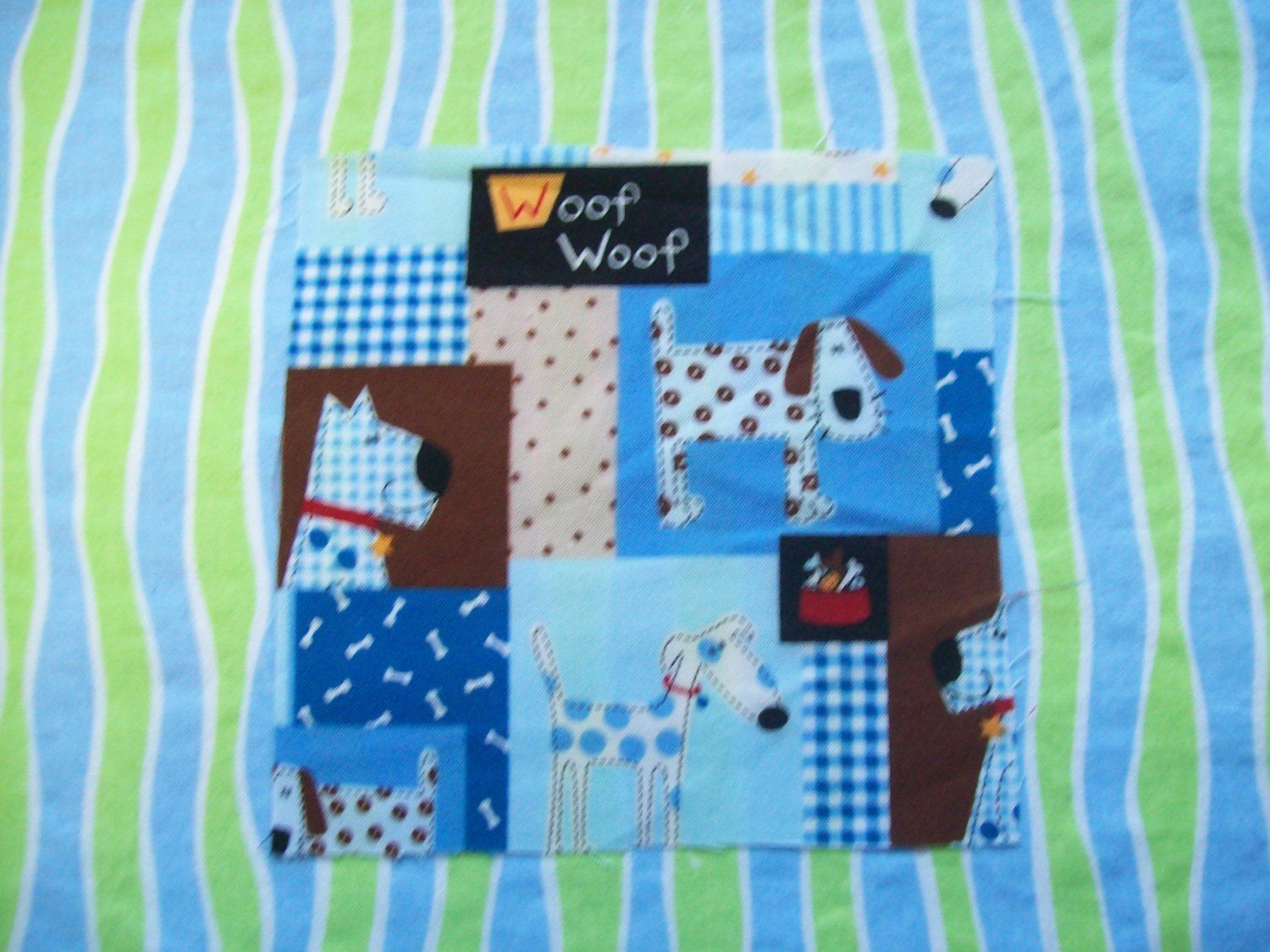
that one is a tad blurry but i think you can get the idea, She said the babys room was green and she was probably going to have yellow and blue acents also. Ok so what to you think?
")