Nice images. Pretty much the same as Sundownaviaries said. Composition can be improved on most using the rule of thirds. The top one is the best placement of the bird in the group, the only con is it is slightly facing away from us and the feet are cut off.
On the last 3, (especially #4 and #6), the head is too close to the top of the image, there needs to be more space there. also the feet are cut off. Sometimes you can get away with cutting off body parts but when they're so close to being in frame they typically need to be in the frame. The last image would do better in portrait orientation instead of landscape (taller pic instead of wider pic).


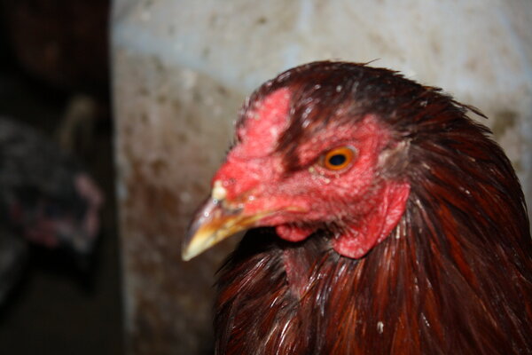


 Rooster labored breathing sneezes while eating
 BYC's 52-week Photography Challenge. Week 8: (Feb 23-March 2, 2026) Theme: Signs
 FOOD: what are you having?
 Open Contest Cutest Baby Fowl Photo Contest—Win a Brinsea Maxi 48 EX Connect—17th Annual BYC Easter Hatch-Along